Thursday, 28 January 2010

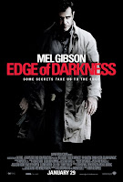
Analysis of Edge of Darkness Poster by Shelley Brookes


This advertisement highlights the title of the film by making it the only font that is red. This could imply blood or danger. ‘Mel Gibson’ is nearly as big as the title as if he is as important, although it isn’t in red. The tag line is in a lot smaller font even though this is important for the audience to know what it is about. The date ‘January 29’ is also highlighted by the size of font. This is precise because it’s important the audience know this and is used an alternative to coming soon.
The picture on the poster is Mel Gibson highlighting that he’s the main character; this is a way of persuading the audience to go and see it. Another aspect of the poster is that he’s in the centre of a black emphasizing the film name which is ‘Edge of Darkness’. But is hard to see whether he is black and white or whether he’s just under a spotlight. Also, he has badge under his coat to the left which is in colour and in view so the audience notice this and the gun his hand would also make people think he is part of the police.
Within the writing at the bottom there is the producer which is BBC films, Warner Brother’s studios, person in charge of screenplay and who it was directed by. There is also a website below this so that the audience can look and find out more information about the film before going to see it. This hints that it will be an action movie but due to the dark colours it could also be a horror.

Poster Analysis By Lucy Davies


Initially, when I looked at the film poster my attention was drawn to the fist with the dagger, stressing the importance of the sharpness of the blade held by the male. This gave me the immediate impression that the film was based on some sort of violence. Using this technique could capture a specific audience’s attention by highlighting the fact that violence could be included in the film. Cleverly, the image of the triangle outlined with orange (which connects to the title ‘Clockwork Orange’) gives the implication of a sharp knife, expanding the emphasis on the blade. Also, using a white background makes the image in the middle become the prime focus of the poster. Furthermore, the male actor is emphasised by his sinister expression and eccentric make-up which could leave the audience questioning why this image was used. The image of the white woman below also leaves a bit of mystery to why it may have been included. This is another clever technique used to capture the audience’s attention by leaving them in suspense.
Including the image, the audience is given a lot of information with the tagline. Having placed the tagline above the main focus of the poster, instinct draws the eyes to the top of the page to read it. It is simple and straight to the point, giving the audience a little insight to what the film is about.
The title is clearly shown in bold, capital letters to stand out with the book writers name above also in bold letters. This could interest any fans of the book to watch the film if they enjoyed reading the novel. In some cases, this is an advantage for the film as the book was a success, which immediately ensures that a target audience will be attracted by this poster. The producers were also included at the bottom of the poster, however, they were not emphasised as much as the author of ‘Clockwork Orange’. The rating is also shown indicating that only a specific audience is eligible to watch the film and it could suggest that the violence in the film could be pretty brutal.


This is a poster of the film, One Flew Over The Cuckoo's Nest. My attention was immediatley drawn to the only object in colour, being the red pad lock. This gave me the implication that Jack Nicholson could be locked up as the image of him and his name above the title inform the audience that he is the main character of the film. Moreover, the high fencing with barbed wire in the background suggest that the film could be based in a prison of some sort. This could interest a specific audience knowing that Jack Nicholson is in the film or that it is based in a mental institution (Judging from the title, the audience may get the impression that it is set in a mental hospital rather than a prison.)
The cartoon like writing used for the title and ‘Jack Nicholsons’ name could imply that there is some element of childness in the film. This could link to the fact that the film is based in a mental institution. Also, the expression given by Jack Nicholson shows that he may be a mental patient.
At the bottom are listings of the producers etc, however, they aren’t exposed as much as the title and Jack Nicholsons name.

Poster Research by Matthew Helliwell


I have researched theatrical posters in order to gain knowledge on what a poster should and should not represent, as we have to make a poster or a trailer for our film.
One poster which i think fails at conveying the films true market potential is the theatrical film poster for the David Fincher film Fight Club. The way that the poster focuses on the useage of soap in the film is really inapropriate, it almost mocks the film. The slogan is also very poor.


A really good example of a theatrical poster is this poster of The Shawshank Redemption, it is very simple and holds a great tagline of
"Fear can hold you prisonor, but hope can set you free,"
This tagline is brilliant for this movie and on the same

wavelength as the films theme. Unlike the Fight Club poster which featured soap. although soap making is a major factor of the film it isnt really in the same theme.


All posters were taken from http://www.impawards.com

Audience Feedback By Lucy Davies

These are the questions we are wanting to ask our audience after they have watched our film, enabling us to get feeback from our film and make any changes if it is necessary. We are wanting to ask these questions to random people after they have watched our film (in the process of being edited) and record the interview in order to get the right amount of helpful feedback we need as a group.

1. What did you enjoy about the film?
Throughout the film, were you able to pick out any favourite parts?
Specifically, was there any parts that stood out to you?
Were you able to follow the film with ease?
2. What did you think about the twist at the end of the film?
Was it easy enough to understand?
Is there anything you would change about the twist or the build up to the main climax?
Was the ending obvious throughout the film?

3. Was there any part that you didn't enjoy, or you didn't think was necessory?
(Answer Yes) Specifically, what didn't you enjoy?
(Answer No) Would you say there was nothing wrong with our film?

4. Do you agree with the 12 rating of the film?
(Answer Yes)Why?
(Answer No)What rating would you give it and why?

5. Overall, what star rating would you give the film?

Sunday, 3 January 2010

More Jump Cut Research by Matthew Helliwell

I was watching the film Notting Hill a few days ago and there was a scene where Hugh Grants rushes into his kitchen to tidy it up before Julia Roberts sees the mess. The Jump Cuts are edited and used very well to create the effect of rush.

Like how you can see in this video


We could use something like this to stop certain scenes lasting forever and boring the audience. I like jump cuts because if edited correctly they can look great and i think they are interesting. We will definatly be using them in our film.